Designing for Apple Vision Pro
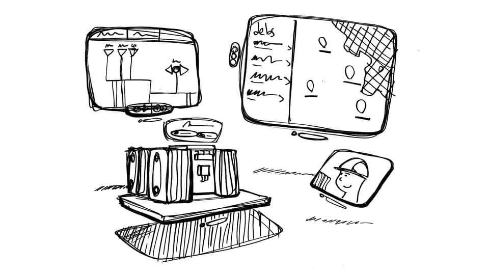
The first time I used Apple Vision Pro, I had a strange feeling. Not awe exactly, that would come later, but something more subtle, yet deeply moving.
I’d watched the videos. I’d read the documentation. I’d even tried other AR/VR headsets before. But the moment I "stepped" into Apple Vision Pro, I knew: this wasn’t like anything else. The fluidity. The clarity. The crisp text. A different kind of presence. It wasn’t just another screen. It was an entirely new spatial environment. And that changed everything.
In this post, I’ll share some key learnings from crafting spatial experiences for Apple Vision Pro. I’ll keep it light, but let me know if there’s anything you’d like me to double-click into.
Beyond the frame
As designers, context is everything. We build for devices with familiar boundaries: phones, tablets, desktops. We think in frames. But Vision Pro invites us to think in space.
Spatial computing demands a deeper kind of empathy. It’s not just about user goals, but posture, attention, and the relationship to the room. You’re not designing for a screen anymore. You’re crafting moments in space.
That shift can be hard. Letting go of the frame is uncomfortable, but it’s also the key to unlocking the platform’s full potential. In spatial computing you have an infinite canvas to play with, and with great flexility comes great responsibility.
Effective use of the spatial canvas is critical to crafting a successful Vision Pro experience.
Craft by making
At Versent, we’ve been exploring what Vision Pro means for enterprise experiences. More than the use cases, it’s been the process that’s taught us the most.
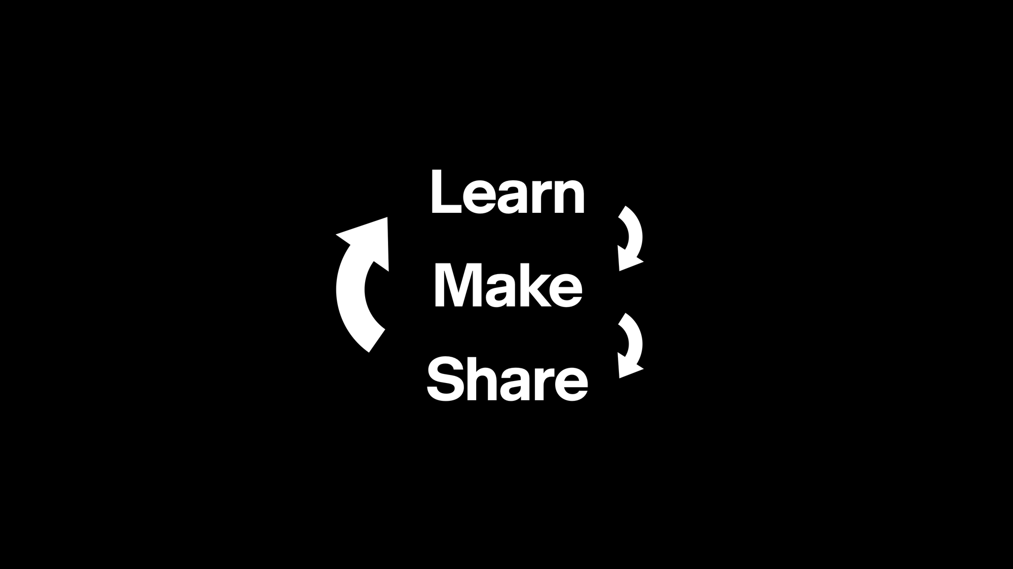
To me, Learn, Make, Share is the minimum representation of the design process: short iteration cycles around idea kernels that slowly but confidently bring form to fragile concepts.
Learn: Immerse yourself in people, context, and process.
Make: Show, don’t tell. Sketch, prototype, simulate—give your ideas a body.
Share: Share early and often. Just explaining your idea to someone else often reveals something new.
Repeat.
This loop is especially vital in spatial computing. Each step, from sketch to prototype to simulator to on-device, reveals new nuances.
Only when we were designing with live code in Xcode, making changes inside Vision Pro, did the experience begin to feel truly refined. You have to feel your app. Walk around it. Listen to it. Move it closer. Make it bigger. Rearrange what’s around it.
On mobiles you can expect to have high degree of control over what appears on screen. In spatial computing, the wallpaper of reality is part of the experience. And I love this.
Prototypes and on-device testing are essential. Pixel-perfect Figma designs won’t cut it.
This process reminds me a bit of the Bauhaus school’s ethos of design through making. They had a strong belief that true understanding comes from hands-on craft. The Bauhaus blurred the line between thinking and doing, with a deep understanding of the materials and their connection to art. That same way of approaching design rings true in this new world of spatial design, and the importance of feeling each interaction in context.
Native first, bespoke where it matters.
One of visionOS’s superpowers is how simple it makes 2D experiences. It's powered by SwiftUI, which is the same foundation as iOS, iPadOS, and more. This makes creating familiar interfaces such as text, lists, buttons and media a breeze. If you've ever developed mixed reality experiences before for other platforms, you might know how painful it can be to create simple and dynamic flat interfaces.
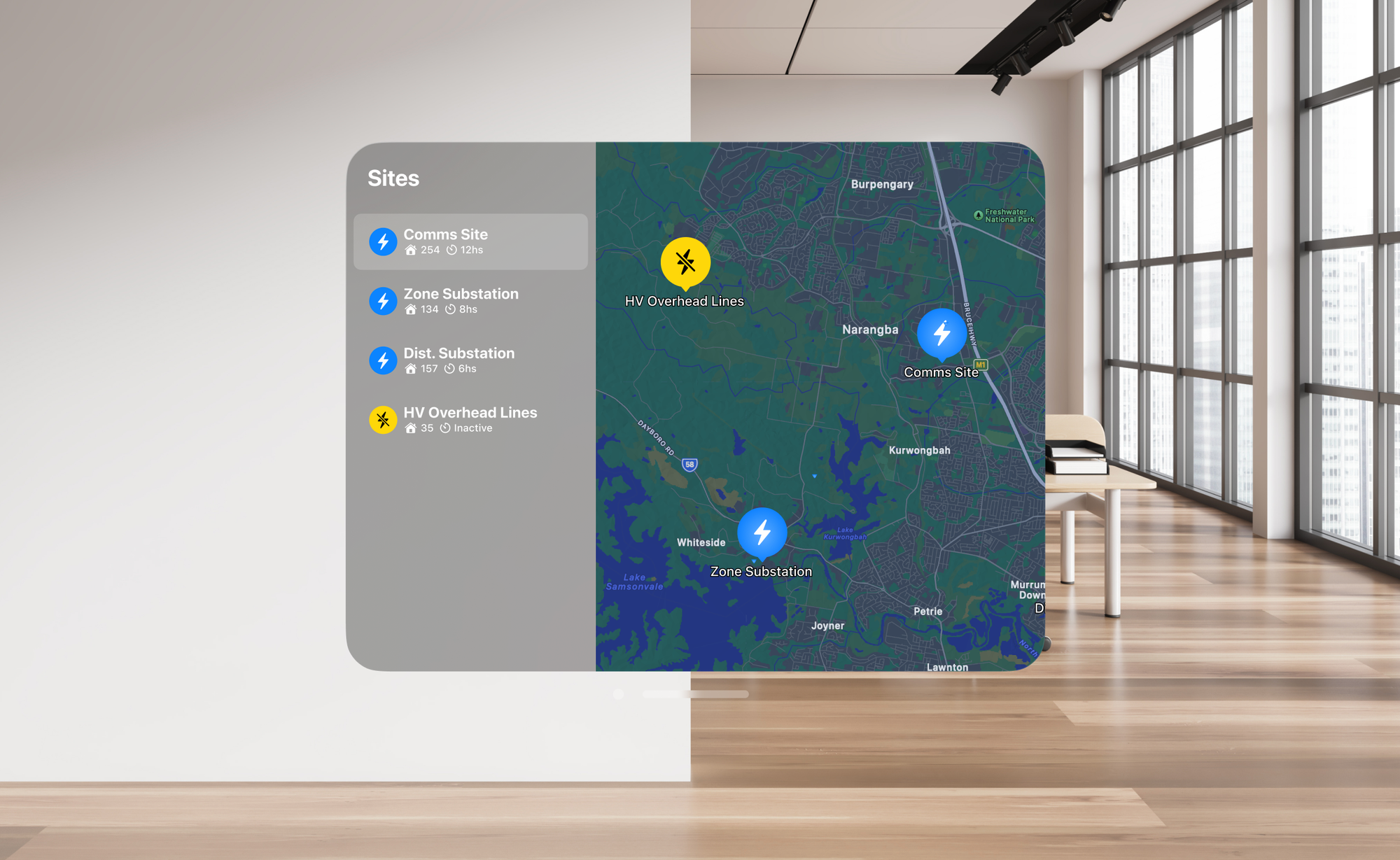
Most spatial experiences should start with a welcome view, preferably in 2D space. From there you can navigate users though the rest of their spatial journey.
With SwiftUI, that's taken care of. Out-of-the-box you get a beautiful interface that elegantly responds to gaze, interactions, its environment lightning and other elements around it. Building on the shoulders of giants, visionOS has the most accessibility features built-in, ready for you to build apps for everyone.
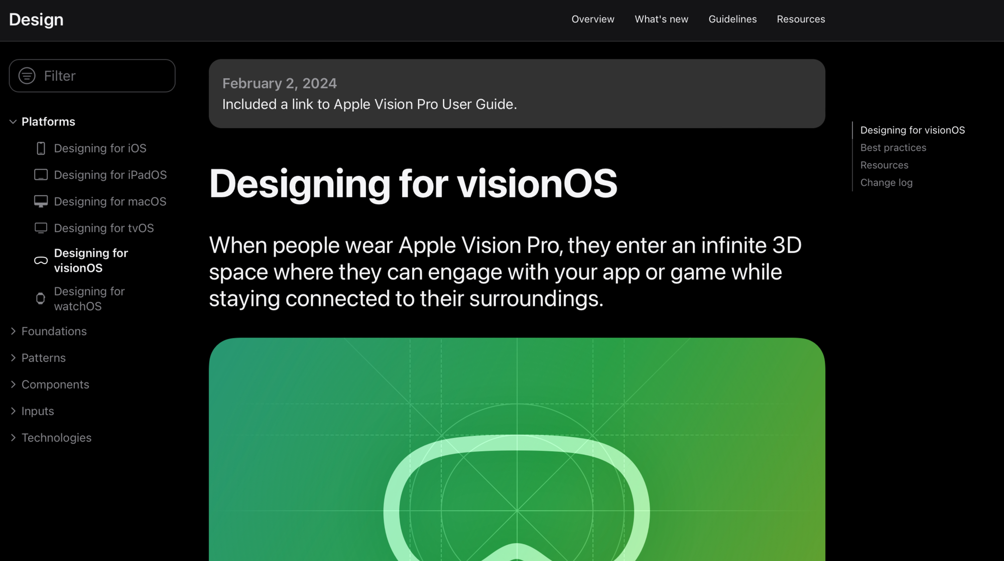
I would strongly recommend that you study Apple's Human Interface Guidelines, and refer back to them when you are designing experiences for the Apple Ecosystem. They are a great asset to ground your explorations in. There is also a ton of content in the Developer app, which should be renamed by now given how much focus there's been on design in the last few years.
Prioritising the use of native components can significantly speed up development and save you a lot of headaches. It may also cause some at times, but that's beside the point.
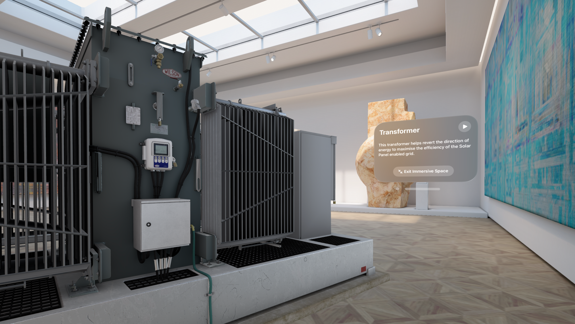
With the essentials covered by native components, you can shift your focus to what makes your experience truly spatial.
The use of 3D assets and Spatial Audio will bring your app to life. These are experiences that hit differently on a spatial canvas. If done right, native frameworks such as ARKit, RealityKit, RoomPlan and Reality Composer Pro can do the heavy lifting for you to make elements feel like they belong in the room and Apple Vision Pro is surprisingly good at anchoring elements in space, surfaces and objects.
All of this combined, unlocks a world of possibilities.
How is this not an iPad app?
It sounds obvious, but it’s surprisingly easy to forget. When you’ve spent years designing for screens, your first instinct is to bring those patterns with you. But spatial computing isn’t just a flat UI floating in front of your face.
There's a lot of interaction patterns that have carried over from iOS and iPadOS into visionOS, and that's great because it's what makes it so intuitive. In order to create an app that feels natively spatial, you need to think differently though. Window sizes and layouts are still important, but spatial computing is mainly about presence.
Your app exists among other apps, within a physical room, viewed from changing angles. It might be in focus, or just casually there. Designing for that reality means asking different questions:
- What’s the role of this experience when it’s not front and center?
- How does it behave in a shared space?
- What’s the right scale, the right distance, the right rhythm?
A key insight that continues to help us craft experiences for visionOS, is asking ourselves: How is this not an iPad app?.
And if you can't answer that confidently, maybe it should be an iPad or iPhone app instead. And that's ok. Continuously asking yourselves this throughout the process can help reinforce the elements that make your experience unique to visionOS.
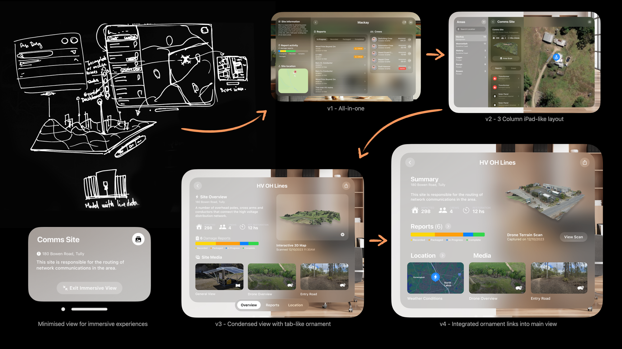
Here's a design progression as we evolved an interface away from "iPad app":
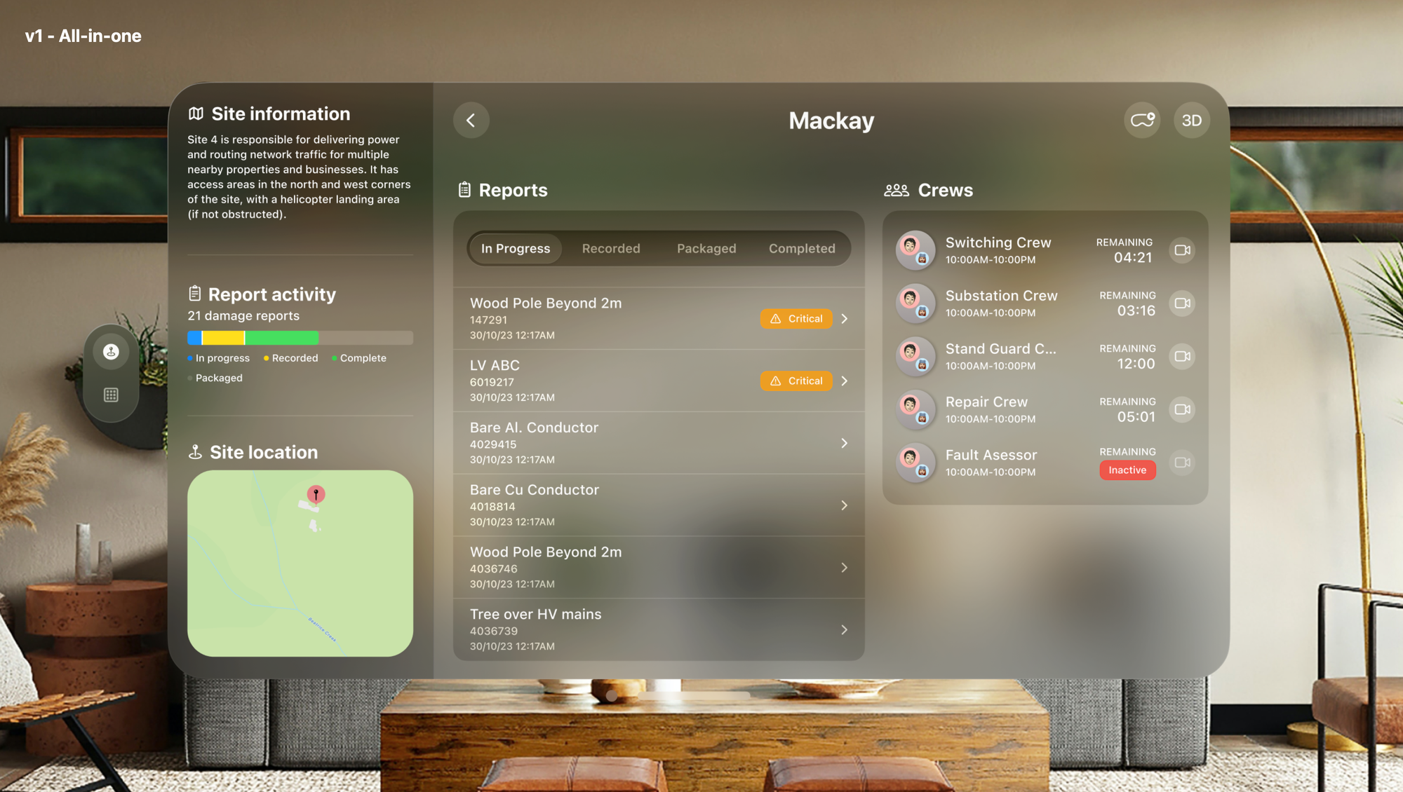
We started with what was required by users, but noticed that the spatial experiences were buried a few views deep.
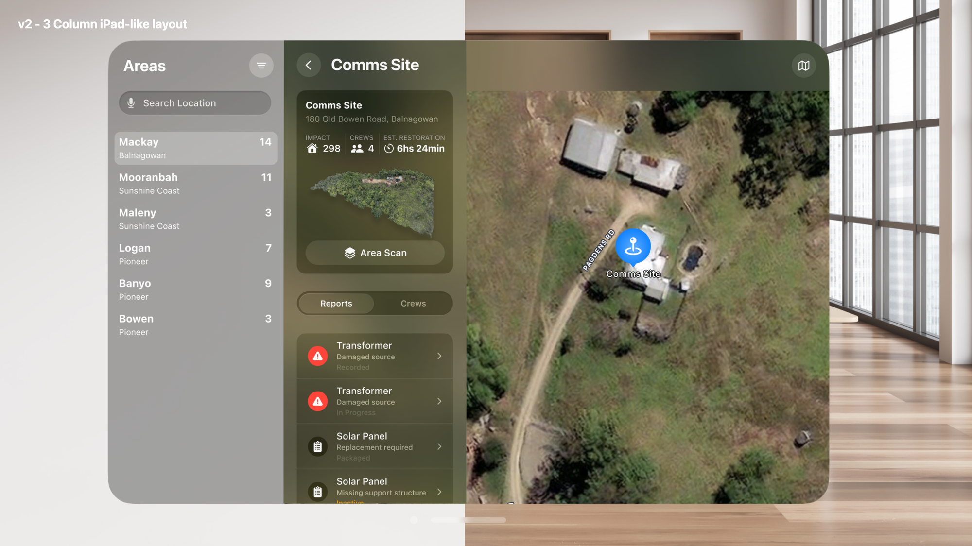
We brought the 3D assets to the forefront and that made a lot more sense. The experience still felt very much like an iPad app. And we wanted to push things further into Spatial.
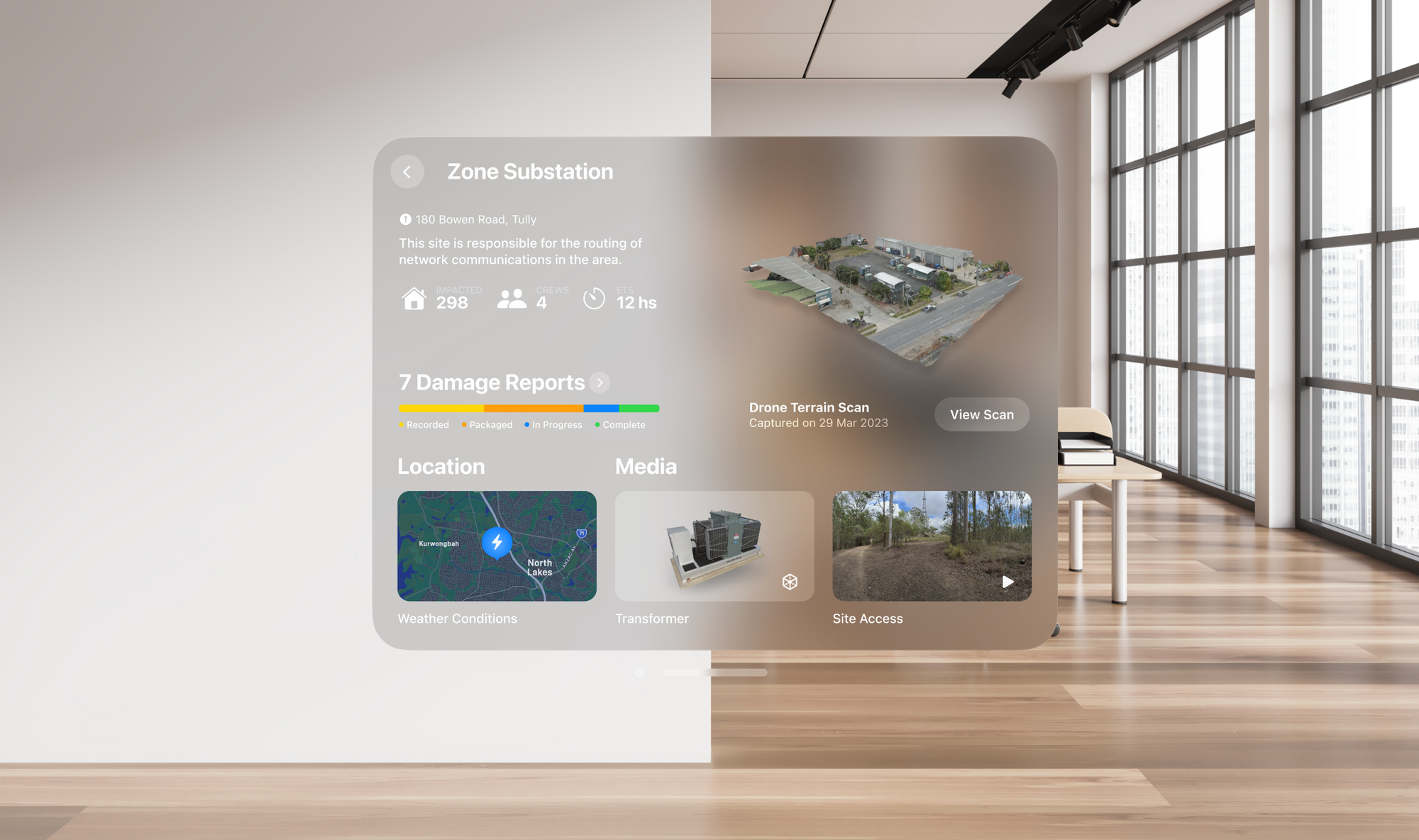
Finally, we revised our creative constraints with spatial in mind, and challenged ourselves on what is the smallest-yet-relevant view we could design, mindful that our use case required the app to live amongst apps such as messaging, FaceTime, email, and more.
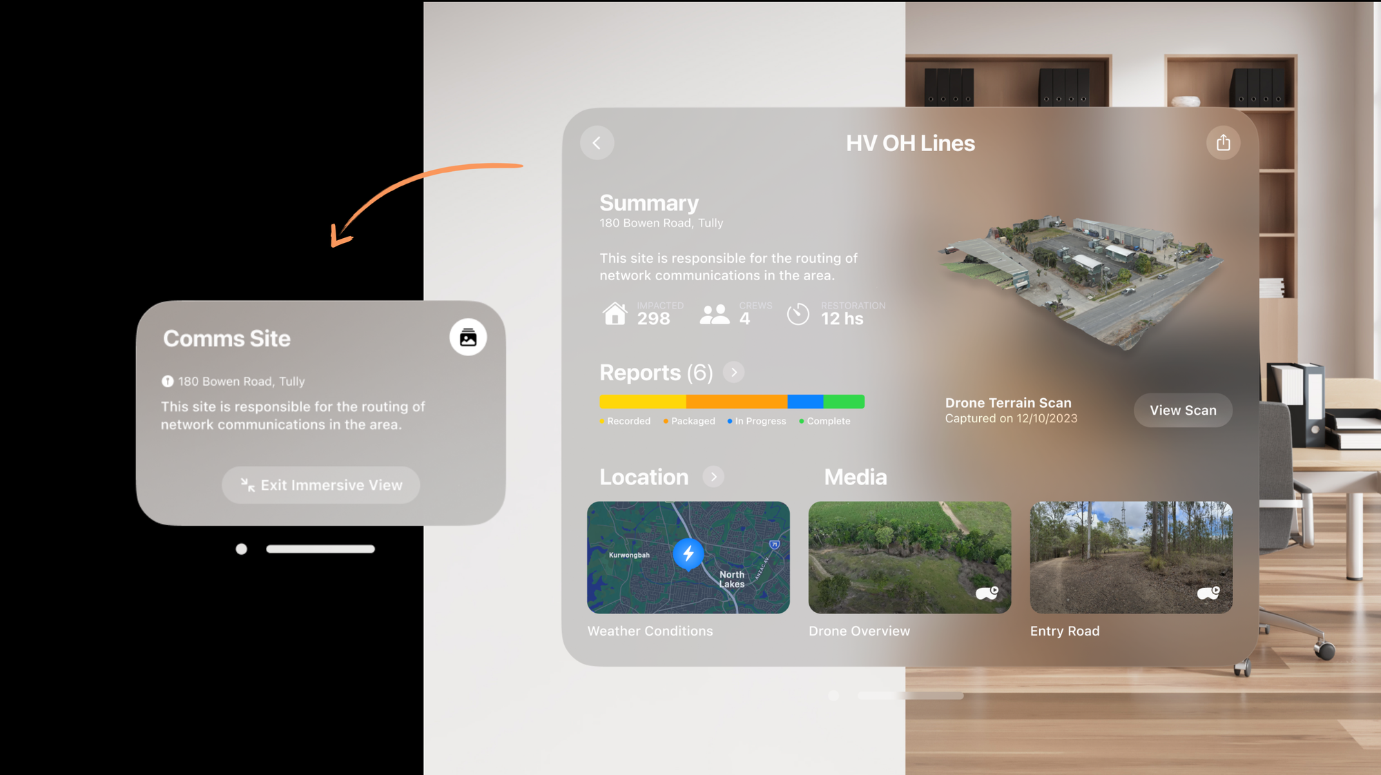
We took it even further, making the main window morph into a smaller navigation and command tool when entering immersive experiences.
I'm still learning and exploring patterns for crafting visionOS experiences, and with each iteration of the OS I'm sure new things will be unlocked. Each use case has its own potential, so make sure to focus on what matters for the audience you are building for.
Spotlight the hero
Spatial Computing experiences can quickly become overwhelming for users if not crafted effectively. I believe it is the responsibility of creative technologists like ourselves to figure out the right balanced experience, before we put apps into the spatial canvas.
Apple Vision Pro introduces a new design constraint I like to call: the spotlight.
Users aren’t navigating with their thumbs, instead they’re guiding focus with their eyes, and what comes into focus is what's "under the spotlight". You need to be mindful of how content and interfaces are presented. You have to choose what matters.
If used properly, the spotlight is your friend. You can use it to guide users through your experience. You can combine size, colour, Spatial Audio, animations and more to draw attention to the elements where you want the user to focus on.
What's worked for me to keep things on track, is to identify a Hero moment in the experience, and design around it. What's THE ONE THING you absolutely want users to experience in your app? What's THE THING that you'd want them to tell others about your app? Find that, and go all in.
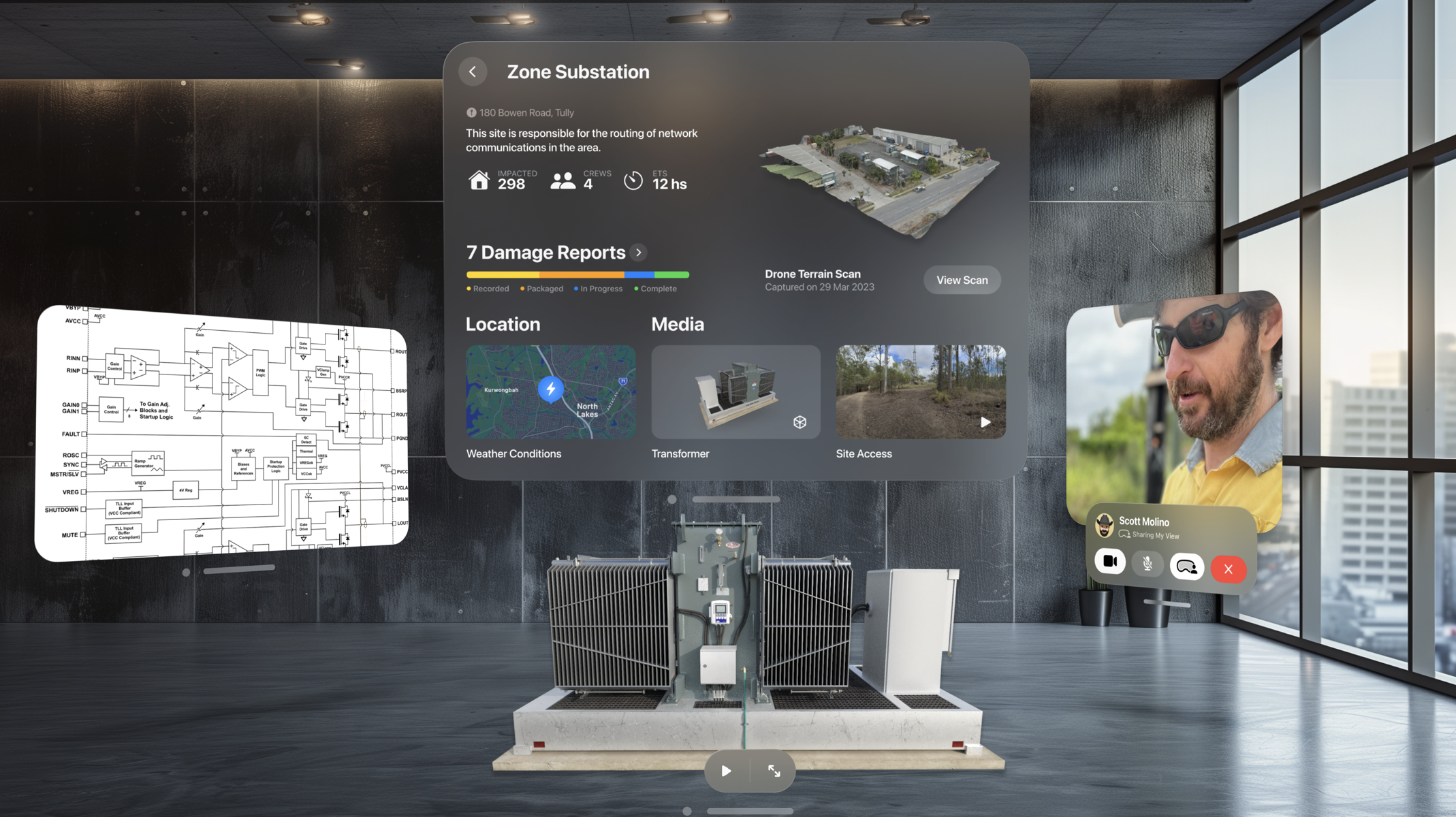
When starting a new experience, it can be tempting to pile up functionality, and do more. I found that finding that Hero moment, and making that the centre of attention, then using the spotlight to guide the experience towards it, is a recipe for delight. This is especially true for new apps.
The hero moment defines the experience.
The scene bends gently around it.
The spotlight becomes your guide.
Play to its strengths
Apple Vision Pro is a mind-blowing piece of technology. It is still very much in its early days, but it already leapfrogs the competition in high-fidelity mixed reality experiences, a.k.a Spatial Computing. It's also one of the first Apple devices that are likely to resonate with Enterprise first, before becoming mainstream.
With that in mind, understanding how people will be using the device, and the use cases in which this technology can make a difference, can help you find a Hero moment that matters, to create beautifully crafted experiences that drive outcomes.
You wouldn't expect people to be out and about in random places using something like Apple Vision Pro, although the internet will prove me wrong. This technology is most likely to be used in a controlled environment, sitting or lying down, and every now and then doing short walks inside a room. For the other stuff you have mobiles and tablets.
Apple Vision Pro has solved two of the biggest challenges in mixed reality: comfort and clarity. Its high refresh rate significantly reduces motion sickness, making it much easier to use for extended periods. And with ultra-high-definition retina displays, text and spatial elements appear crisp, clear, and easy to read, even at a distance.
Beyond visual fidelity, spatial collaboration is deeply integrated into the platform. You can work with others in shared spaces, and perform familiar tasks like multitasking across multiple apps, just as you would on a Mac or iPad.
With that in mind, as of May 2025, just two weeks out from WWDC25, I believe Apple Vision Pro is currently best suited to the following use cases:
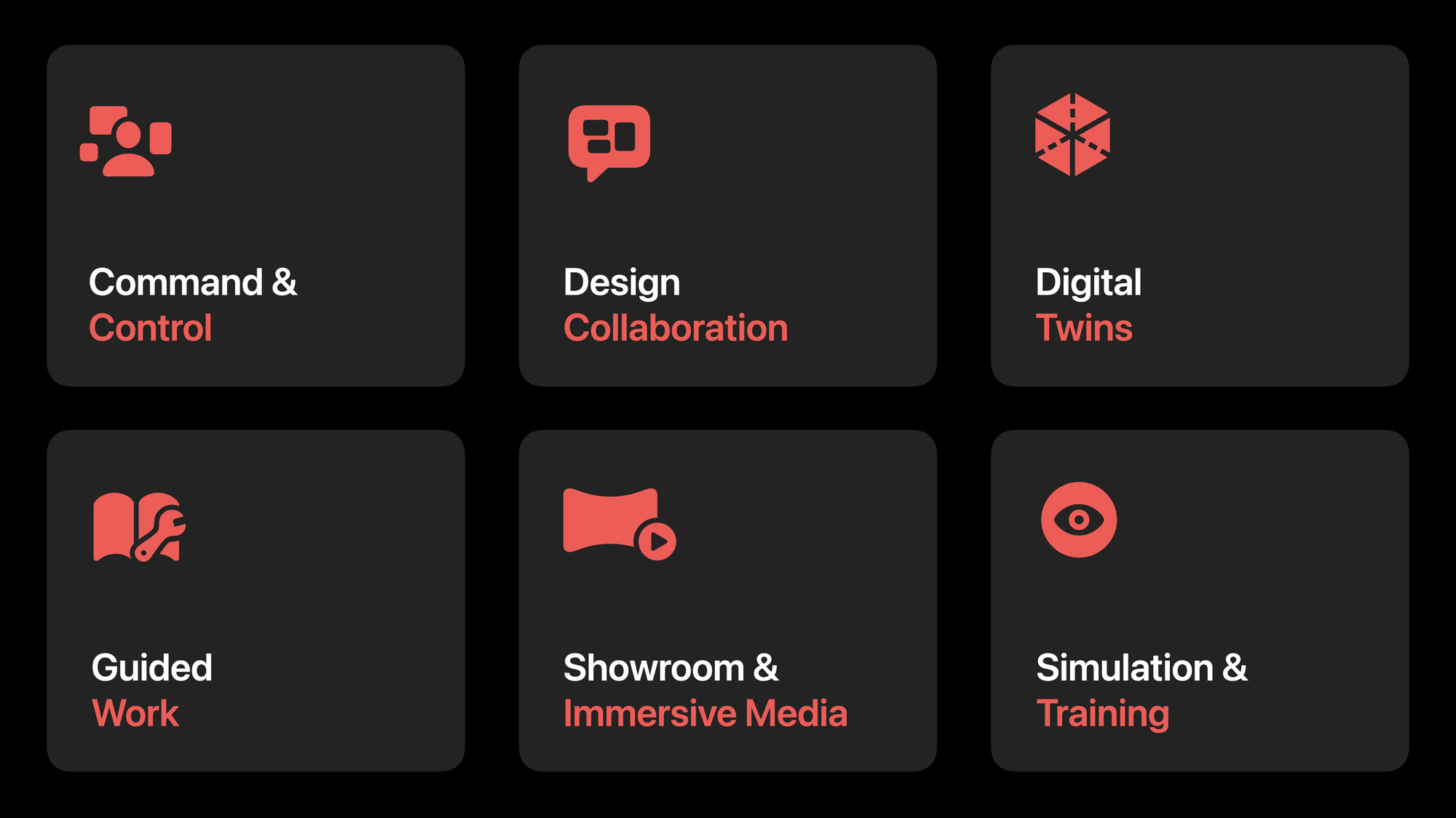
- Command & Control: Spatial dashboards for operations teams.
- Design Collaboration: Engineers and designers working around shared 3D models.
- Digital Twins: Live, spatial representations of physical environments.
- Guided Work: Remote assistance tools that reduce the need for travel, bringing the field to the experts, not the experts to the field.
- Showroom & Media: Immersive demos for trade shows and presentations.
- Simulation & Training: Safe, repeatable exposure to complex scenarios.
That said, these aren’t the only use cases. The list reflects my perspective, shaped by experience in enterprise settings. It’s worth noting that entertainment and immersive video remain among the platform’s most compelling strengths.
Shaping the future of Spatial
Apple Vision Pro is such an amazing platform to design and build for. Spatial Computing is a new canvas and colours to craft experiences with. It's in its early days, but now is the time to play and explore.
It's up to us, the designers, developers, product people, educators, creative technologists to shape the future of this platform. There's huge potential for it.
Designing and developing for visionOS has been some of the most fun I've had in over 20 years of creating experiences.
If you haven't tried it, I'd encourage you to.
If you have, I'd love to hear your story.
